Tuesday, December 21, 2010
Blog Entry # 2.6 - Process Journal 1 (C)
2. create the image for the cover ( Pencil needed)
3. write the title and words inside the card ( Pencil needed)
4. color everything( markers)
A total of two hours is required.
Blog Entry # 2.5 - Design Brief
Friday, December 17, 2010
Blog Entry#2.7- Holiday Reasearch (A)
1. What is the name of the holiday?
Answer: Eid al-Fitr
2. When will the holiday be celebrated in 2011?
Answer: The holiday will be celebrated on Wednesday, August 31, 2011.
3. Who celebrates this holiday? (Countries, religious groups, ethnic groups)
Answer: Muslim people celebrate this holiday.
4. Why is this holiday celebrated? What is the significance of this holiday?
Answer: This holiday is celebrated to mark the end of the month-long fast of Ramadan and the start of three-day feast. The significance of this holiday is that it is meant to increase spiritual devotion.
5. How is this holiday celebrated? Include any rituals, food, costumes, dance or music associated with this holiday.
Answer: This holiday is celebrated by many Muslims waking up early in the morning to pray. Then they wear their best clothing, decorate their homes, forgive wrong doings and give money to the poor. They prepare special foods and invite family and friends . Cards and gifts are exchanged and children receive presents.
http://www.timeanddate.com/holidays/us/eid-al-fitr
Thursday, December 16, 2010
BLog Entry #2.4 - Product Analysis 3 (A)

2. What type of images are used – photos, cartoons or graphics? How do the images used connect to the holiday/event?
3. In your opinion, is the cover of the card attention-grabbing? Explain exactly why or why not. Consider the arrangement of elements as well as use of images, color and text.
4. What text is written on the front of the card? Where is it located on the front?
5. What text is written inside the card? Where is it located inside the card?
6. In your opinion, does the text inside the card connect to the image(s) on the cover? Explain exactly why or why not.
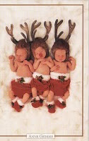
I think the text inside the card connects with the image on the cover because it is basicly saying dreams come true and the babies are like the dreams or hold dreams in them that come true.
7. What types of information appears on the back of the card? (Do not copy it exactly!)
8. To what consumer is this card targeted? (Consider age group, gender, race and/or religion.) What about the design led you to this conclusion?
I think this card is targeted towards adults in their 30's and up. The babies in the image led me to this conclusion because little kids or teens are no likely to want to buy this card but it somehow attracts older people.
Friday, December 10, 2010
Blog Entry # 2.3 - Product Analysis 2 (A)
 1. What holiday/event does the card represent?
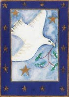
This card represents Christmas.
2. What type of images are used – photos, cartoons or graphics? How do the images used connect to the holiday/event?
The cartoon used in the image is a bird holding a twig and there are stars around it.
3. In your opinion, is the cover of the card attention-grabbing? Explain exactly why or why not. Consider the arrangement of elements as well as use of images, color and text.
I think the picture is attention grabbing because of the details and colors.
4. What text is written on the front of the card? Where is it located on the front?
There is no text written on the front of the card.
5. What text is written inside the card? Where is it located inside the card?
Seasons Greetings is writen inside the card. it is located around the middle of the card.
6. In your opinion, does the text inside the card connect to the image(s) on the cover? Explain exactly why or why not.
i think the text connects to the image because it is saying seasons greetings and a bird is flying down as if to say it is the start of a new holiday.
7. What types of information appears on the back of the card? (Do not copy it exactly!)
On the back there is the publishing company, where it was printed, where its being distributed and a phone number.
8. To what consumer is this card targeted? (Consider age group, gender, race and/or religion.) What about the design led you to this conclusion?
i think this card is targeted at people of ages 50 and up because it has a cool tone which is not somethin that attracts a child.
Blog Entry # 2.2- Product Analysis 1(A)

2. What type of images are used – photos, cartoons or graphics? How do the images used connect to the holiday/event?
3. In your opinion, is the cover of the card attention-grabbing? Explain exactly why or why not. Consider the arrangement of elements as well as use of images, color and text.
5. What text is written inside the card? Where is it located inside the card?
6. In your opinion, does the text inside the card connect to the image(s) on the cover? Explain exactly why or why not.
7. What types of information appears on the back of the card? (Do not copy it exactly!)
8. To what consumer is this card targeted? (Consider age group, gender, race and/or religion.) What about the design led you to this conclusion?
Blog Entry #2.1 - Design Task (A)
Sunday, October 24, 2010
Blog Entry # 1.7 Description Specifications (A)
- its purpose is to control many electronics and put security on them
-it is for people who want to controll many electronics in 1 remote controll
-the audience are people who forget where they put the remote controll and want security
-it is a medium size
-rocks
-it should look like a really large remote controll
-the materials needed are plasstics and metals
-the aesehetics aare the designs that are on it
BLog Entry # 1.6 Design Brief (A)
The remote controll is 10 inches in length, 3 inches in width and 1 inch in hight. The mini remote controll is 4 inches in lenght, 2 inches in width, and 1/2 inches in hight. You can put data of all your remotes from the computer to the remote controll and the mini remote controll. You can set up a security on it so that your electronics cannot be used without your knowledge. It can be customized to whatever color or design a person wants it to be. It uses 4 AA batteries or can be charged with sunlight. It has an alarm system if the electronic is being used without putting in the password without the remote controled.
This remote controll is for people who don't usually remember where they leave their remote conterolls and want to have a sense of security over their elecronics. It is important because it can prevent theft of electronics or the data stored within. People will feel at ease when they leave their computer at home with important information stored in it. It will also create more jobs.
Thursday, September 30, 2010
Blog Entry # 1.5- Areas Of Interaction (A)
Blog Entry # 1.4- Design Task (A)
Blog Entry #1.3-Poster Analysis 3 (A)

The image used in the poster is about loving and understanding another culture. i don't the image effectively communicates the point of the poster because all i see is flags and it doesnt show anything about loving or understanding another culture. The color used in the background could have been different to blend in with the picture but the font;s color is good. The words used in the poster are located in the left side of the poster as if to make a point and have a picture backing it. I think the fonnt used was a good choice since it seemed to go with the picture.
Blog Entry #1.2-Poster Analysis 2 (A)

The image used in the image above is about one person explaining something to another. In my opinion, the image above effectively communicates the point of the poster because the poster is about communicating which is what they are doing. The background used was good, but i think they could have made the font a different color to make it look better. The words used in the poster are located in the bottom to describe what the picture abouve it is about. Ithink the font used was good because it is easy to read and fits the poster.
Friday, September 24, 2010
Blog Entry #1.1- Poster Analysis 1 (A)

The main image used in the poster above shows 4 people working together to raw a boat. The image effectively communicates the point of the poster because it takes four people to raw that boat and they have to work together in the same rhythm or else it won't work. The image is taken at sunset which i think makes the point get across even strongly since it represents that they have worked together during the day to make it this far until the night. the background is black which makes the image pop up. The words are located on the bottom as if to say " This is team work". I think the font used was really good because it really blend in.


