Wednesday, May 4, 2011

Blog Entry #4.15 - Process (E)

The background color, word game, and an extracted picture had been added to the back of my cereal box. More text and pictures need to be added to the back of my cereal box. I would give myself a 6 because i have been doing my work and have gotten a lot of things done. I can work faster to add more things to the back of my cereal box in order to improve my grade.

Wednesday, April 27, 2011

Blog Entry # 4.12 - Process (E)

iIhave the background for my cereal box front and i have extracted Igor Stravinski's picture. i still need to add the words on the cereal box front. I would give myself a 5 but i can improve that by working faster.

Blog Entry # 4.10 - Slogan (B)

The taste you can compose, puff energizers, breakfast for leaders, lawful cheerios, hufs puffs

The taste you can compose is the best because it is catchy.

Blog Entry #4.9 - cereal Names (B)

Ski cheerios, Stravinski pebbles, Piano puffs, Pebbles composed, Russia Puffs.

I think Stravinski Pebbles is best because it is catchy and doesn't sound so bad.

Blog Entry # 4.8 - Target Consumer (B)

The consumers my cereal box will try to attract are adults from ages 25 - 40. My cereal will have a relistic image to attract these consumes. It will also have a plain background instead of one with designs and details.

Blog Entry #4.5 - Design Brief (A)

I am going to design and make a cereal bot about Igor stravinski. The goal of the product is to attract buyers and inform them about Igor Stravinski. My target market's demographics are adults from 35- 40. I consider the image and coloring of the product to be the element factors that define a successful product. It should have catchy titles written in good looking letters. things not to do are put colors that do not match with the picture. I don't want to see that in my design.

Blog Entry # 4.4 - Plan (C)

step 1- I need to find pictures. It will take about 30 min. and i will need an internet connection.
step 2- I will extract any pictures that i need to extract. It will take about 10 min. and i will need Adobe Photo Shop.
step 3- I will choose a background. That will take about 2 min. and i will need Adobe
Illistrator.
step 4- I will put in any pictures including the extracted ones. That will take about 5 min. and i will need Adobe Illistrator.
Step 6- I will add words in it. That will take about 5 min. and i will need Adobe Illistrator.

Thursday, March 24, 2011

Blog Entry #4.7 - Image Resarch (A)


Blog Entry #4.6 - Person Research (A)

1. Name of Notable Person: Igor Stravinsky
2. Web Addresses of all Sources (copy and paste)

http://www.notablebiographies.com/St-Tr/Stravinsky-Igor.html

http://www.musicianguide.com/biographies/1608000671/Igor-Stravinsky.html

artsalive.ca/pdf/mus/stravinsky_all_e.pdf

http://musiced.about.com/od/20thcentury/p/stravinsky.htm

http://www.brainyquote.com/quotes/authors/i/igor_stravinsky.html
3. Biographical Information
a. Date of Birth and Death

Birth: June 17,1882

Death:April 6, 1971
b. Place of Birth and Death (or current residence):

Place of birth: Oranienbaum, Russia

Place of death: New York, New York
c. Family (e.g. parents, siblings, spouse, children)

Father:Fyodor Stravinsky

Mother: Anna Stravinsky

Wife: Katerina Nossenko

2nd Wife: Vera de Bosset

Children: Fyodor, Ludmila, Svyatoslav, Sulema, Milena, Nicholas, and Katherine

d. Education

Studied the piano starting at the age of 9.

studied with the famous Russian composer Nicolai Rimsky-Korsako.

studied law and philosophy at St. Petersburg University
e. Occupation

Russian composer
4. Two-three Quotes (either about the person of from the person)

"I am an inventor of music."

"haven't understood a bar of music in my life, but I have felt it.Read more: "

"Money may kindle, but it cannot by itself, and for very long, burn."


5. Significant contribution(s) to World History

he made 3 major ballets that won him international awards.


6. Ten terms related to the person

Russia, France, America, Composer, Poland, Vladimir, Firebird,
Oedipus Rex, Oustilug, Pulcinella.
7. Timeline of at least five important dates in the person’s life
1920, war ended.
1925, first appearance in the U.S.
1913, his work premeared in Paris
1914, he moved to switzerland
1910, first performance

Wednesday, March 23, 2011

Blog Entry #4.3 - Adult Cereal Box (A)

1. Describe all of the ways the designer has targeted adults with this cereal box.
Answer: The cereal box states that the cereal can lower a persons cholesterol and puts an image of the cereal on the front of the box.

2. What gender of adult is targeted? What elements led you to this conclusion?

Answer: men are targeted because they would want to lower their cholesterol levels and the cover is kind of plain.

3. What is the advertising slogan?

Cheerios

Blog Entry #4.2 - Children's Cereal Box (A)


1. Describe all of the ways the designer has targeted children with this cereal box.
Answer: The designer had put a cartoon on the front of the box to attract children. The tittle of the cereal is catchy and you can watch webisodes online as it says on the box.
2. What gender of children is targeted? What elements led you to this conclusion?
Answer: It is targeted towards boys because the cartoon on the cover is a boy.
3. What is the advertising slogan?
Answer: Lucky Charms is the advertising slogan.

Blog Entry #3.16 - Human Ingenuity Evaluation (E)

A person who is interested in ancient history would not be ineterested in visiting Poland after seeing my poster because i don't have a lot of pictures of ancient architectures or relics.

Blog Entry #3.15 - Create Evaluation (E)

I would give myself a 6 because i was able to put pictures together, make backgrounds and add texts. I was also able to Extract pictures and bring them to Adobe Illustrator. I can use Adobe Illistrator to make posters for my other classes and to also add things to pictures.

Blog Entry #3.14 - Design Evaluation (E)

I could improve my poster by adding a few more pictures and more texts. The texts could have also been in bright colors so they can pop out. I could have also added a famous person from Poland other than the president.

Thursday, March 17, 2011

Blog Entry #4.1 - Design Task (A)

For this design task, i am creating a cereal box about Igor Stravinsky. The cereal box is supposed to give information about him. There is supposed to be something on all 6 sides of the Box.

Blog Entry #3.13 - Completed poster


Wednesday, March 9, 2011

Blog Entry#3.12- Process Journal 3 (E)

On my poster, i have added many pictures of the foods of Poland, historical places, the presedent, flag and map. I need to add two extracted picturesto my poster. I also need to add the currency and required texts. I would give myself a 6 because i was motivated, independant and was respectful to others. I need to improve on how fast i do the classwork.

Wednesday, March 2, 2011

Blog Entry #3.10 - Process Journal 2 (E)

I have made the background of my poster and put the graduation cap on the poster thus far. My work can be improved by choosing a better background color. The background should make everything blend in and i don't think mine does that. I would give myself a 6 because i have been personally engaged and i been doing things safely, being cooperative and shown respect to others. I could improve by working faster in class.

Wednesday, February 16, 2011

Blog Entry #3.8 - Target Consumer (B)

the tourist my poster will try to attract is someone in their twenties. thay are the kind of people that like to eat different kinds of food, do many kinds of activities and visit historical places. for example, if my poster shows a picture of a Polish cusine and an ancient building in Poland , the viewer would want to go there to taste the food and see the building in person.

Wednesday, February 9, 2011

Blog Entry # 3.5 - Design Brief (A)

I am going to design and make a poster of Poland that includes basic details of Poland and tourist attraction sites. The goal of this product is to make people want to go to poland. My consumer targets are males and females at the age of 18 and up. They like to go to many different places and want a veriety of things to do in a country. I consider coloring, images and attractive headings to be the most important factors that define a successsful product. There shouldn't be colors that don't blend in together and i don't want to see images that are not exciting in my design.

Blog Entry #3.4 - Process Journal 1(C)

In order to complete my country poster, i will need to first find out information about Poland. That will take me about an hour. I will need the computer to do this. Next i will use images to put in the poster. I will get it from the computer and it should take me 20 minutes. I will choose background colors and put in writings using Adobe.

Friday, February 4, 2011

Blog Entry #3.3 - Poster Research(A)


The pictures in this poster made the poster stand out more to me than the other poster because i see good seenarys. i see sighsts of the city that i would want to be in. based on the potos and text used, young people are being targeted by this poster. they are the kind of people that like to shop and do many things in a city. This poster says that there are shops to go to and places to eat and drink in the city.,

Blog Entry #3.2 - Dream Destination (A)


If i could go anywhere in the world, i would go to Italy. i am interested in visiting this country because i want to see its history. During this visit i would visit Rome, Florence, and Venice. i want to go to Rome because i want to see the Collosium, the Parthenon and the Palazzo del Quirinale. i want to see paintings in the museums of Florence. in Venice, i want to go travel in boats in between buildings. i also want to taste their many cuisines including Pizza.

Blog Entry #3.1 - Design task (A)

For this project , i have been asked to create a poster for iceland. The poster is supposed to make people want to go to that country. The poster will include icelands main infomation like its capital city and language. There will be imags of its flag, a map with iceland, currency, historical sites, current leader, and other images related to the country.

Monday, January 24, 2011

Blog Entry #2.21 - Greeting Card 3 Reject (B,D)

The consumer targeted by this greeting card is a child. This design is less appealing to the consumer than the other design because it doesn't have as much detail as the other card. This design can be improved by using a darker blue than the image as the background to better appeal to the consumer.

Blog Entry #2.20 - Greeting Card 3 (B,D)

The consumer targeted by this greeting card is a child. The image is meant to appeal to this consumer because it is an animated image with a little girl in it. The background color of the inside of the card was changed because it did not match the outside of the card.

Blog Entry #2.19 - Greeting Card 2 Reject (B,D)

The consumer targeted by this greeting card is an adult. This design is less appealing to the consumer than the other design because the image had lots of things going on at once. If the image was changed to a simpler version, this design could better appeal to the consumer.

Blog Entry #2.19 - Greeting Card 2 Reject

Blog Entry #2.19 - Greeting Card 2 Reject

Blog Entry #2.18 - Greeting card 2 (B,D)


The consumer targeted by this greeting card is an adult. The image is supposed to appeal to this consumer because it is lots of foods and drinks on the table and it sends out a message of a special holiday beoing celebrated. The background was changed because it didn't go with the image.

Blog Etnry 2.17 - Greeting Card 1 Reject (B,D)

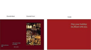
The consumer targeted by this greeting card is a teenager. This design is less appealing to the consumer than the other design because the background color does not match with the image as best as it could have and there a lot of empty space in the background. This design can be improved by changing the background color.

Blog Entry #2.16 - Greeting card 1 (B,D)


This greeting card is made for teenagers. The image is supposed to appeal to this consumer because it has lots of popular and historical places that are brought together in a fun way. There are also animated decorations. Compared to the original sketch, the background color was changed because a blue backgroung did not blend in with the image, but the a background did.

Sunday, January 23, 2011

Blog Entry #2.22- Human Ingenuity

A person that doesn't like drinking can be offended by the card that has lots of food and a drink that looks like alcohol on the table. This is because they can think alcohol is bad and shouldn't be on the cover of a card.

Thursday, January 20, 2011

Blog Entry # 2.15 - Process Journal 4 (E)

The image, writing and color of the card have been completed so far. I need to do this for 5 more cards in order to finish makeing all 6 cards. My work can be improved by choosing background colors that go with my picture. I would give myself a 5 on criteria F because i have been doing what i am supposed to do safely and i was motivated. I can improve my score by being more independant because i ask a lot of questions about the work.

Blog Entry # 2.14 - Progress (D)